As part of a 24-hour hackathon, I helped design Streamline, a fictional app that allows users to search the databases of streaming services and cable providers to find where to watch specific movies and shows.

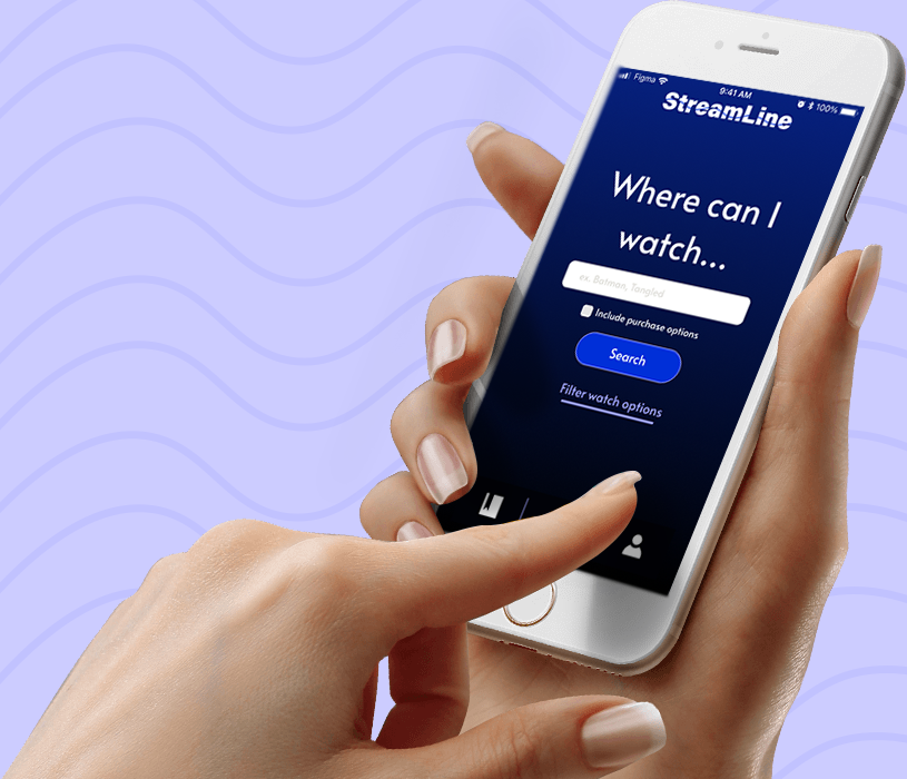
Design of Streamline’s main search functionality.
On February 20, 2021, I participated in StormHacks hosted by SFU Surge, a virtual 24-hour hackathon competition to build a project on the theme of “connection” using design and programming. I chose to make time for Stormhacks during a busy semester, to practice designing under time constraints and geek out with fellow creators.
For our project, my partner Alex Grant and I created Streamline, a fictional app where users can search where to watch their favourite content. The concept for Streamline was inspired after personal frustration searching multiple streaming apps trying to find Marvel superhero movies.
I was responsible for the organization, wireframes, and prototype, while Alex worked on branding.
Turning Concept into Design
I started by listing the app’s features and categorizing them (Figure 7). For the app to

Sketch list of Streamline features organized into categories of use and hierarchy.

Sketches of Streamline’s visual interface and user flow based on four sections; 1) Application on-boarding which describes Streamline’s features, 2) creating a custom profile tailored to user’s streaming and cable services, 3) Main search functionality to find where to watch specific content, 4) Bookmarking feature to save content and profile settings to edit services
Putting Together the Pieces

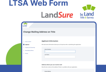
I designed a set of low-fidelity wireframes in Figma, a digital design and prototyping software, focusing on how users would navigate the app. For example, Figure 10 highlights the flow of navigation for search functionality. I wrote the copy for Streamline to provide an understanding of the features. The wireframes were handed off to Alex for branding.

Wireframes for searching (left), browsing results (middle), and viewing details (right). Users first search for content by pressing return on the keyboard which brings up related results and immediately shows available platforms. Click on content for a detailed view regarding purchase options, synopsis, and cast, click back to browse search results.
Making it Interactive
I created an interactive Figma prototype, which makes design elements such as buttons clickable, allowing judges to fully experience the app.
I ran into a technical challenge when trying to use multiple prototype overlays on a single screen, which place a design on the top of the existing screen. I realized this option is not available in Figma, and alternatively used a pre-defined user path meaning users must select specific options for the prototype, unlike a real app.


Figma overlay to organize saved content. When the bookmark is clicked, a pop-up overlay appears, over the screen.

Close up of Figma prototype illustrating pre-defined user path. Users must select Netflix, Prime Video, and then Apple TV in that order instead of selecting any available app. This is because the overlay with a purple border, which indicates an app has been selected, can only be applied once per screen.
We Won!
We recorded a pitch for submission and were judged on five criteria: technological proficiency, real-world impact, intuitive interface, presentation, and wow-factor.
I am thankful I made the time to attend the hackathon as it taught me to focus on the big picture rather than pixel perfection. Also, I received my first ever design achievement so that was super exciting!
Streamline won Best UX/UI out of 60 submissions and 410 participants at StormHacks. The judges commended our effort to solve a relatable real-world problem and use of Figma interactions.

Announcement of Streamline winning Best UX/UI at Stormhacks closing ceremonies over Youtube Live by SFU Surge Vice-President, Praneer Shrestha.