As part of an academic UI/UX project, I researched and designed a new feature for the music app Spotify that allows users to organize their library by grouping playlists into a collection.
The goal of this project was to create an additional feature for an existing mobile app, by utilizing research to make a strong case for the feature. The project was completed individually over 3 weeks, where I was responsible for conducting user research, analyzing the current design and interaction systems, and designing the new feature. I created high-fidelity visuals and prototypes in Figma (check out the prototype at the end of the project).
Uncovering Frustration Through User Research
Over 3 weeks in May 2021, I conducted user research to gain a better understanding of the listening habits and frustrations of Spotify users. I used a Google Forms survey to collect initial research regarding different pre-existing features of Spotify and later selected 4 participants for in-person and remote user interviews to walk through the steps of how they navigate Spotify.


Quotes from Google Forms survey by Spotify users and research synthesis of goals and frustrations that came from user interviews
Getting to the Problem
The majority of Spotify users listen to music by using playlists, either that they make themselves or find pre-made. But with an abundance of playlists available, users struggle to organize and find their music within the long scrolling library.
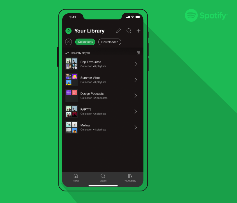
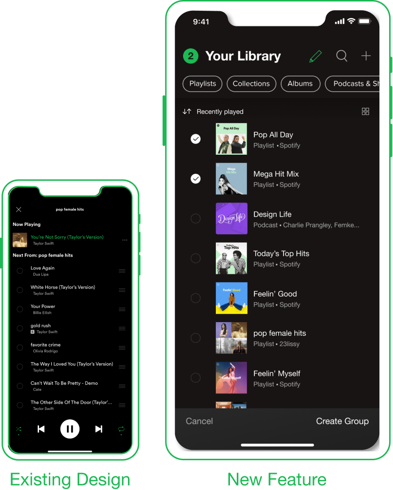
A New Feature: Spotify Playlist Collections
Playlist collections allow a user to select playlists from their library and group them in a collection. Essentially a collection is a playlist of playlists.

Design of new Spotify Playlist Collection. Group tile shows up in user’s library with an arrow icon. Once clicked on it reveals a list of playlists
A Collection allows users the control to categorize their library in a way that makes sense to them, rather than relying on Spotify’s sorting filters such as recently played. For example, collections can be based on the genre of music (pop), the time period (summer through the decades), by friends (all playlists by Kyle), or by mood (party playlists).
Collections to organize playlists are meant for music fans, and avid Spotify users, since they may have over 20+ playlists accumulated in their library. In this sense organizing a library can be seen as a shortcut for expert users to tailor their experience to speed up their interaction.
Working Within Spotify’s Design System

The first step in the design process was to analyze Spotify’s existing design system and interaction patterns, to ensure any new designs would fit appropriately within the application. By leveraging the already existing design and interaction patterns, users can rely on their past experience with the app and know what to expect. It is not only about the aesthetics of the application but also about creating a consistent experience.


Swipe Bottom to Top

Swipe Right to Left

Tap on Elements
Tap on Elements
Analysis and recreation of Spotify’s design system including colours, typography, icons and interactions
Implementing Designs; From Paper to Prototype
I started the design of the Spotify Collection by sketching the user flow for a possible interface. While this was still a brainstorming stage, I worked to incorporate previous research of Spotify’s design system to re-use existing patterns that users would be familiar with.

Rough sketches of user flow, interface designs, and Figma mockups
I made high-fidelity mockups of the layout in Figma, utilizing Spotify’s existing design system and analysis from my research. This stage was about finalizing the visual design to replicate Spotify. Once the layouts were completed I populated the designs with real content from Spotify to better visualize the prototype in its context.
Design Key Moments
Selecting Playlists
While most mobile grouping patterns are drag and drop (such as iPhone folders), I deliberately chose a simple checkbox method to avoid complex interaction while scrolling through the library. The selection interaction is based on the selection for adding songs to the queue because it has the option to tap to select with visual feedback.
Edit a Collection
Since the function of editing a collection is similar to that of editing a playlist, I choose to re-use the same interface patterns and icons that users would already be familiar with. Because the functionality is the same, it doesn’t make sense to re-invent the editing options.


Open a Collection
Opening a collection to view and listen to playlists is based on a simplified version of the playlists layout. In order to streamline the process of finding a playlist there is minimal options available so that the user can get straight to the playlists without any interruptions.
Library View
There are two options to view collections in a users Library; either the general view for recently played or by filtering to display all collections. A collection will appear in recently if a playlists in the collection has been recently played. Collections are primarily meant to group together playlists, but users also have the option to add podcasts shows for further flexibility.

Check out the Figma Prototype!
Reflecting on the Research Process
Throughout this project, I gained practical experience conducting design research to inform and validate my design concept.
This was my first time conducting user research by using survey and interview practices. The biggest consideration when conducting user research was to pay attention to any bias or assumptions we have as a designer as they can harm the quality of results.
I continued my research by analyzing Spotify’s current design and interaction systems and incorporating the research into my new designs. Working within an existing design system was a fun challenge, especially to see how closely I could replicate Spotify’s interface.